Case study 02
Aha!
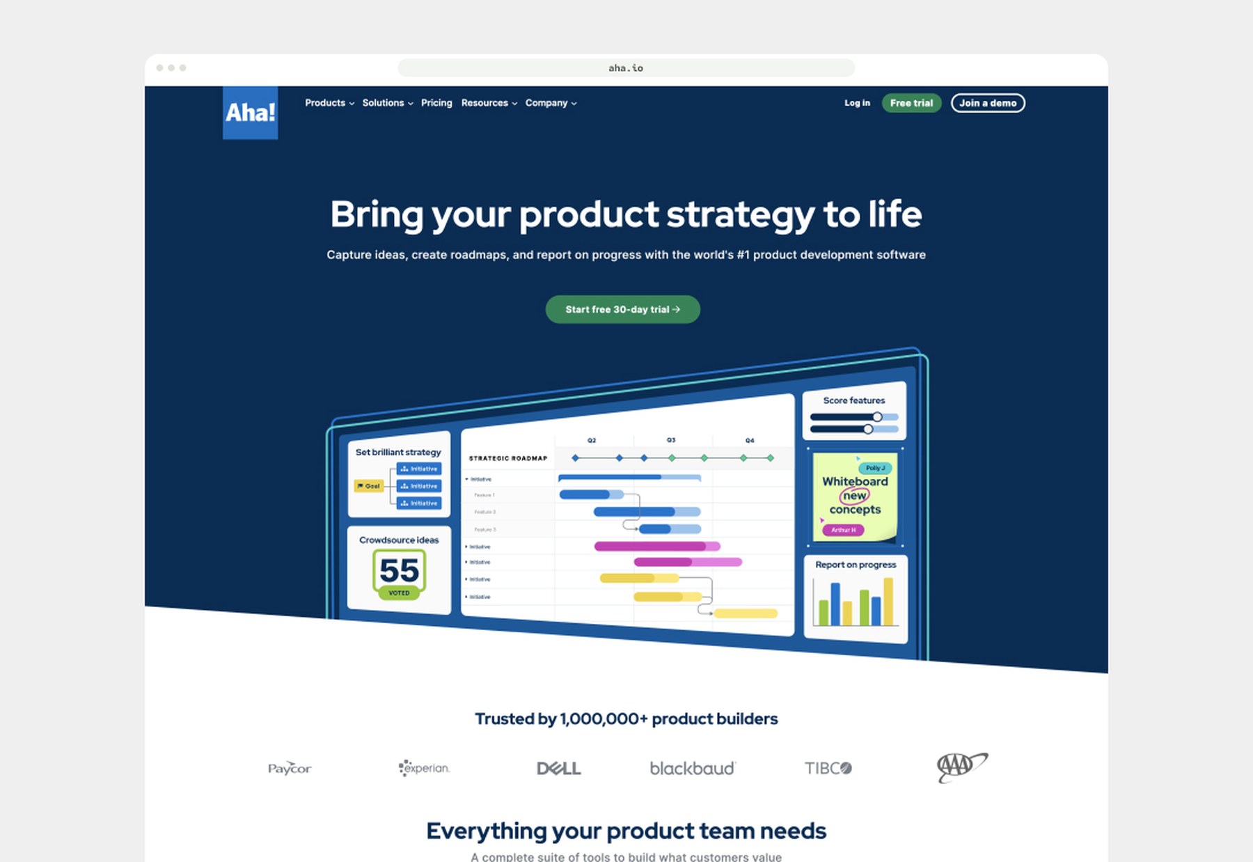
Aha! is self-funded, fully remote and wildly profitable: $100M in ARR by 2022 with no sales team. Over 1 million product builders use it to turn strategy into shipped work.
I co-led the brand modernization: typography, color systems, personas and marketing web standards across every digital channel. Then I rebuilt the web design system on Atomic Design principles, with reusable Figma component libraries that sped up page launches and kept everything consistent. Responsive landing pages tightened the funnels and backed up the positioning.
The challenge
Why the website needed a redesign
Business goals
- Increase conversions through improved experience and clarity
- Support new product launches and growing offerings
- Create a maintainable, scalable web foundation
User goals
- Find relevant information quickly and clearly
- Improve accessibility and meet WCAG 2.1 compliance
- A consistent, intuitive experience across every page
Homepage / move your cursor acrossdrag across
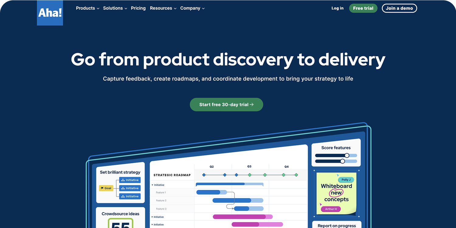
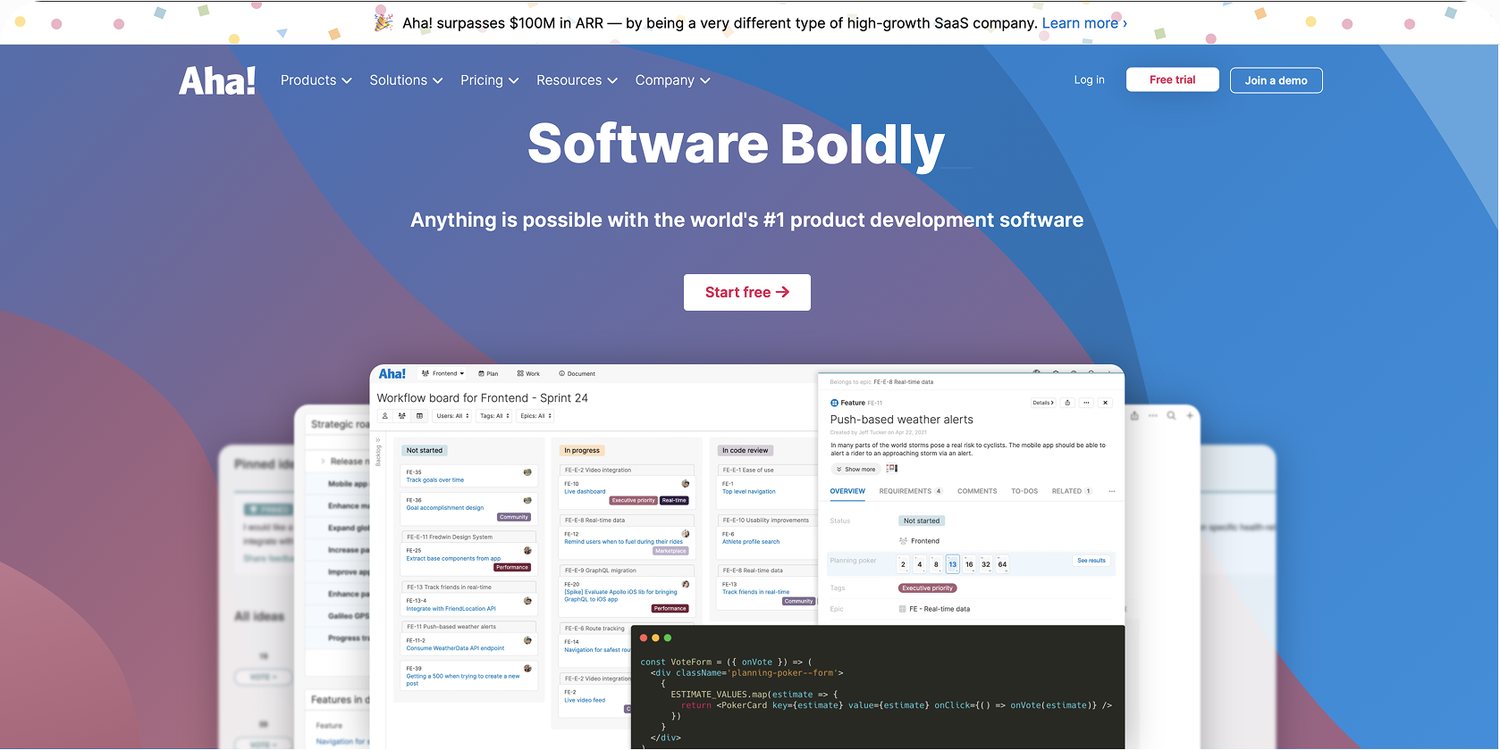 OldUpdated
Success
Goals for success, business and UX
Quantitative
- +20% conversion from marketing site to trial sign-up
- -25% bounce rate on product-specific pages
- Faster page load and a lighter DOM, a dev metric that falls out of clean components
Qualitative
- Consistent brand experience
- Users can complete their top 3 tasks in under 30 seconds
- Positive usability and accessibility feedback
target: conversion from site to sign-up
target: bounce rate on product pages
Discovery
Researching pain points and opportunities
Tested with internal users and the CX team, and worked with brand and product marketing from day one.
How I got there
Project milestones and my role
Step 01 of 06
Audit
- Heuristic evaluation
- User-flow and task analysis
- Analytics and behavior data review
- Accessibility scan
- Content and visual consistency review
My role
UX lead on the Aha.io website redesign and design system rollout, on a team of three (me and two graphic designers), working between brand, marketing, development and leadership from the first audit to the final rollout.
UX leadership
- User flow mapping
- Component definitions
- Interaction patterns
- Worked alongside two graphic designers
Design systems
- Built the Figma component library and design tokens
- Wrote usage guidelines and documentation
- Aligned tokens with the developers’ Tailwind CSS 3.4 tokens
Research and scoping
- Audit: heuristic evaluation, analytics review, accessibility scan
- Stakeholder interviews and usability testing
- Prioritized by effort and value, then phased the rollout
Accessibility
- Color contrast, focus states and semantic HTML at the foundation
- Held every component to WCAG 2.1 AA
- Passed the audit with minor adjustments
Facilitation
- Kept brand, marketing, dev and leadership aligned
- Worked with brand and product marketing on naming
- Tested with internal users and the CX team
Key decision
Aha! Moments
I pulled shapes straight from the product, the pills, rectangles and bars product managers see every day in their roadmaps, and turned them into accent shapes for emphasis. We called them Aha! Moments. Emphasis on the site now speaks the same visual language as the product.
Scoping smart
Build for impact, phase for scale
Focus
- Core pages first: Home, Product Overview pages, CTAs and forms
- Designed reusable components to unlock a rapid build of secondary pages
- Phased rollout: MVP first, iterative refinement next
Low effort / Low value
- Reorganizing file naming conventions in Figma
- Updating outdated iconography in minor pages
- Tweaking rarely used components
Low effort / High value
- Tokenizing brand colors and typography
- Standardizing button styles (atoms)
- Publishing design system documentation in Figma
- Implementing a spacing and layout grid system
- Auditing existing components for redundancy
High effort / Low value
- Refactoring legacy internal tools (if not customer-facing)
- Pixel-perfect parity between marketing and product UI
- Building bespoke animations or micro-interactions
High effort / High value
- Rebuilding high-traffic pages with new components
- Creating a flexible card and content component system
- Developing a live component library in Figma
- Rolling out a responsive navigation redesign
- Improving accessibility to WCAG 2.1 AA across all components
The system
Built from the atoms up
- 120+ components across the entire site, all built from the same atoms
- Created a Figma component library and design tokens
- Ensured accessibility at the foundational level: color contrast, focus states and semantic HTML
- Aligned design tokens with the developers’ tokens in Tailwind CSS 3.4
Collaboration
Co-creating with teams and stakeholders
We all win in collabs.
Before and after
A more cohesive, accessible experience
Integrations / move your cursor acrossdrag across
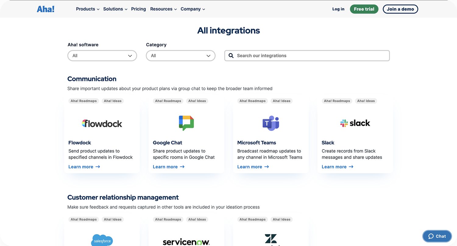
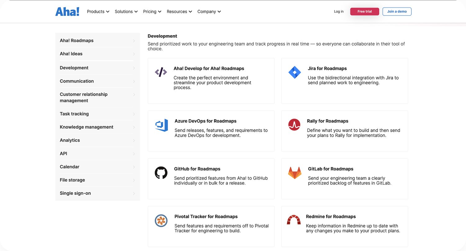 20222024
2022
- List view grid system
- Click to filter side navigation
- Cluttered, and not scalable
- Rigid content structure
- Not responsive friendly
- Little to no interaction
- Not modular friendly, not in a system
2024
- Updated to a card grid system
- New search and way-finding system
- Visual hierarchy and scalability
- Flexible content display
- Responsive by nature
- Better engagement and interaction
- Supports modular design systems
Results
What we delivered, and what it delivered
Reflections
What I learned, and loved
What we learned
- Design systems are ongoing products
- Balance consistency with flexibility
- Early dev alignment prevents rework
- Tokens improve scalability and speed
- Build accessibility in from the start
Wins we are proud of
- Faster handoffs with tokenized libraries
- Unified UI across product and marketing
- Designers now reuse, not reinvent
- Shared docs built team-wide trust
Next time, we would
- Align teams on naming earlier
- Validate components with users first
- Integrate accessibility in QA
- Provide system training and support
The parts of our designs influence the whole, and the whole influences the parts.
Brad Frost
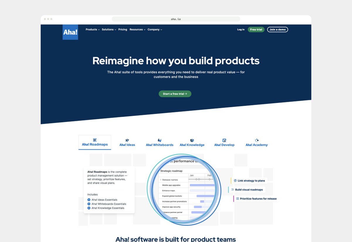
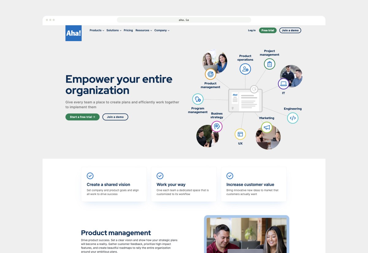
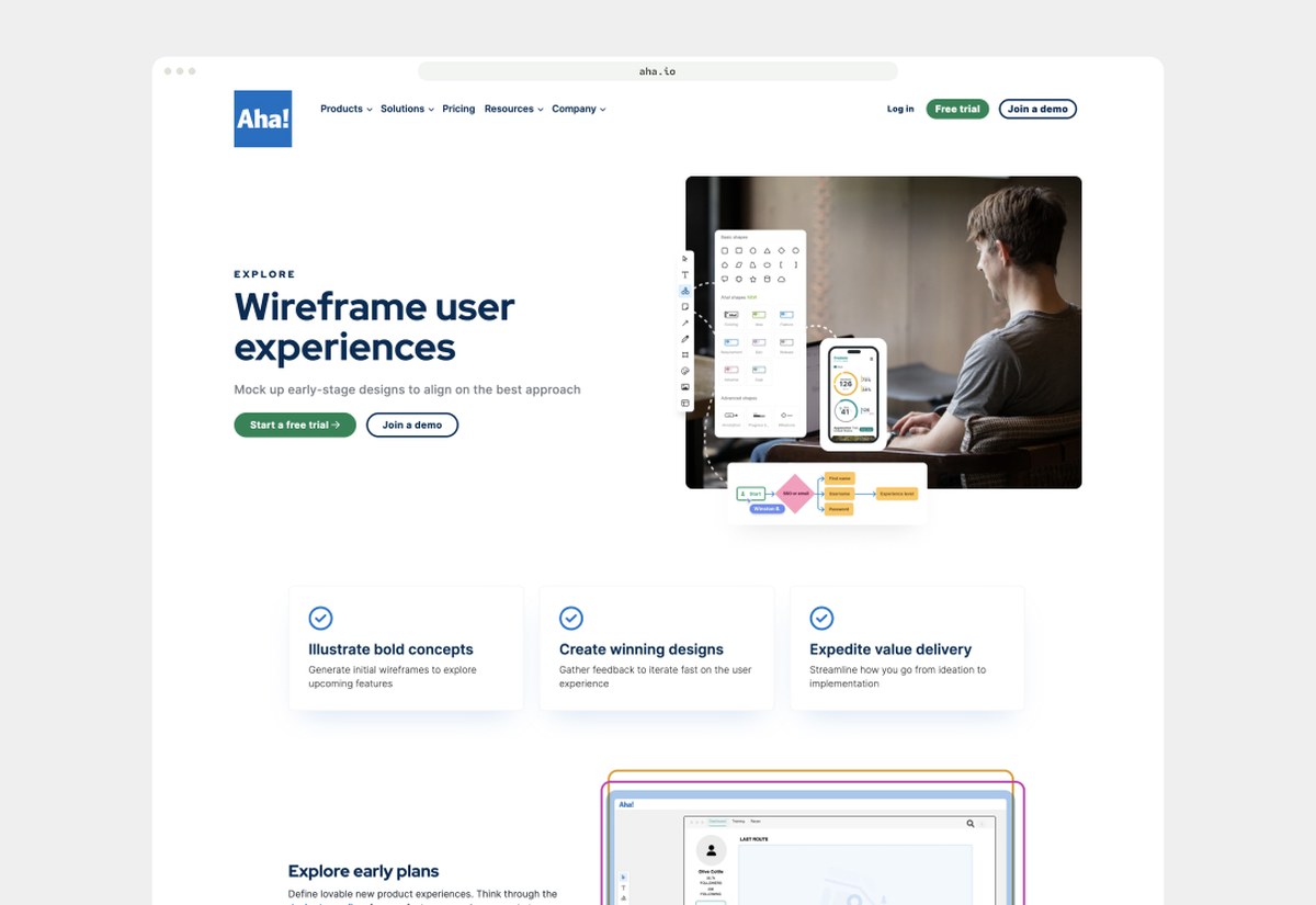
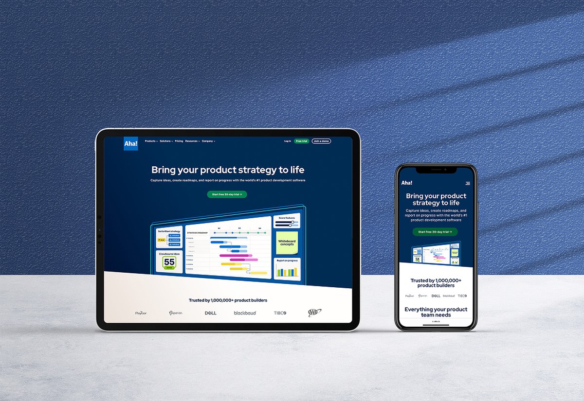
Marketing site / Homepage, product, teams and responsive
The pages